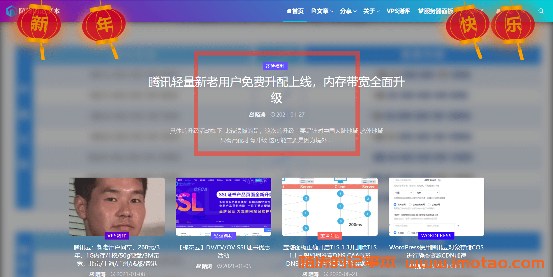
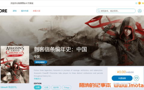
代码插入到网站body内即可,为新年增加一点年味~
<style>
    .deng-box1 {
        position: fixed;
        top: -30px;
        left: 10px;
        z-index: 9999;
        pointer-events: none;
    }

    .deng-box2 {
        position: fixed;
        top: -25px;
        left: 150px;
        z-index: 9999;
        pointer-events: none;
    }

    .deng-box3 {
        position: fixed;
        top: -28px;
        right: 10px;
        z-index: 9999;
        pointer-events: none;
    }

    .deng-box4 {
        position: fixed;
        top: -26px;
        right: 150px;
        z-index: 9999;
        pointer-events: none;
    }

    .deng-box1 .deng {
        position: relative;
        width: 120px;
        height: 90px;
        margin: 50px;
        background: #d8000f;
        background: rgba(216, 0, 15, 0.8);
        border-radius: 50% 50%;
        -webkit-transform-origin: 50% -100px;
        -webkit-animation: swing 3s infinite ease-in-out;
        box-shadow: -5px 5px 50px 4px rgba(250, 108, 0, 1);
    }

    .deng-box2 .deng {
        position: relative;
        width: 120px;
        height: 90px;
        margin: 50px;
        background: #d8000f;
        background: rgba(216, 0, 15, 0.8);
        border-radius: 50% 50%;
        -webkit-transform-origin: 50% -100px;
        -webkit-animation: swing 4s infinite ease-in-out;
        box-shadow: -5px 5px 30px 4px rgba(252, 144, 61, 1);
    }

    .deng-box3 .deng {
        position: relative;
        width: 120px;
        height: 90px;
        margin: 50px;
        background: #d8000f;
        background: rgba(216, 0, 15, 0.8);
        border-radius: 50% 50%;
        -webkit-transform-origin: 50% -100px;
        -webkit-animation: swing 5s infinite ease-in-out;
        box-shadow: -5px 5px 50px 4px rgba(250, 108, 0, 1);
    }

    .deng-box4 .deng {
        position: relative;
        width: 120px;
        height: 90px;
        margin: 50px;
        background: #d8000f;
        background: rgba(216, 0, 15, 0.8);
        border-radius: 50% 50%;
        -webkit-transform-origin: 50% -100px;
        -webkit-animation: swing 4s infinite ease-in-out;
        box-shadow: -5px 5px 30px 4px rgba(252, 144, 61, 1);
    }

    .deng-a {
        width: 100px;
        height: 90px;
        background: #d8000f;
        background: rgba(216, 0, 15, 0.1);
        margin: 12px 8px 8px 10px;
        border-radius: 50% 50%;
        border: 2px solid #dc8f03;
    }

    .deng-b {
        width: 45px;
        height: 90px;
        background: #d8000f;
        background: rgba(216, 0, 15, 0.1);
        margin: -2px 8px 8px 26px;
        border-radius: 50% 50%;
        border: 2px solid #dc8f03;
    }

    .xian {
        position: absolute;
        top: -50px;
        left: 60px;
        width: 2px;
        height: 50px;
        background: #dc8f03;
    }

    .shui-a {
        position: relative;
        width: 5px;
        height: 20px;
        margin: -5px 0 0 59px;
        -webkit-animation: swing 4s infinite ease-in-out;
        -webkit-transform-origin: 50% -45px;
        background: #ffa500;
        border-radius: 0 0 5px 5px;
    }

    .shui-b {
        position: absolute;
        top: 14px;
        left: -2px;
        width: 10px;
        height: 10px;
        background: #dc8f03;
        border-radius: 50%;
    }

    .shui-c {
        position: absolute;
        top: 18px;
        left: -2px;
        width: 10px;
        height: 35px;
        background: #ffa500;
        border-radius: 0 0 0 5px;
    }

    .deng:before {
        position: absolute;
        top: -7px;
        left: 29px;
        height: 12px;
        width: 60px;
        content: " ";
        display: block;
        z-index: 999;
        border-radius: 5px 5px 0 0;
        border: solid 1px #dc8f03;
        background: #ffa500;
        background: linear-gradient(to right, #dc8f03, #ffa500, #dc8f03, #ffa500, #dc8f03);
    }

    .deng:after {
        position: absolute;
        bottom: -7px;
        left: 10px;
        height: 12px;
        width: 60px;
        content: " ";
        display: block;
        margin-left: 20px;
        border-radius: 0 0 5px 5px;
        border: solid 1px #dc8f03;
        background: #ffa500;
        background: linear-gradient(to right, #dc8f03, #ffa500, #dc8f03, #ffa500, #dc8f03);
    }

    .deng-t {
        font-family: Arial,Lucida Grande,Tahoma,sans-serif;
        font-size: 3.2rem;
        color: #dc8f03;
        font-weight: bold;
        line-height: 85px;
        text-align: center;
    }

    .night .deng-t,
    .night .deng-box,
    .night .deng-box1 {
        background: transparent !important;
    }

    @-moz-keyframes swing {
        0% {
            -moz-transform: rotate(-10deg)
        }

        50% {
            -moz-transform: rotate(10deg)
        }

        100% {
            -moz-transform: rotate(-10deg)
        }
    }

    @-webkit-keyframes swing {
        0% {
            -webkit-transform: rotate(-10deg)
        }

        50% {
            -webkit-transform: rotate(10deg)
        }

        100% {
            -webkit-transform: rotate(-10deg)
        }
    }
</style>
<div class="deng-box1">
<div class="deng">
<div class="xian"></div>
<div class="deng-a">
<div class="deng-b"><div class="deng-t">新</div></div>
</div>
<div class="shui shui-a"><div class="shui-c"></div><div class="shui-b"></div></div>
</div>
</div>
<div class="deng-box2">
<div class="deng">
<div class="xian"></div>
<div class="deng-a">
<div class="deng-b"><div class="deng-t">年</div></div>
</div>
<div class="shui shui-a"><div class="shui-c"></div><div class="shui-b"></div></div>
</div>
</div>
<div class="deng-box3">
<div class="deng">
<div class="xian"></div>
<div class="deng-a">
<div class="deng-b"><div class="deng-t">乐</div></div>
</div>
<div class="shui shui-a"><div class="shui-c"></div><div class="shui-b"></div></div>
</div>
</div>
<div class="deng-box4">
<div class="deng">
<div class="xian"></div>
<div class="deng-a">
<div class="deng-b"><div class="deng-t">快</div></div>
</div>
<div class="shui shui-a"><div class="shui-c"></div><div class="shui-b"></div></div>
</div>
</div>
原创文章,作者:陌涛,如若转载,请注明出处:https://imotao.com/4924.html
 微信扫一扫
微信扫一扫 